Solidified
Branding
-
Role
Lead Designer
Branding
Marketing Design
-
Design Challenge
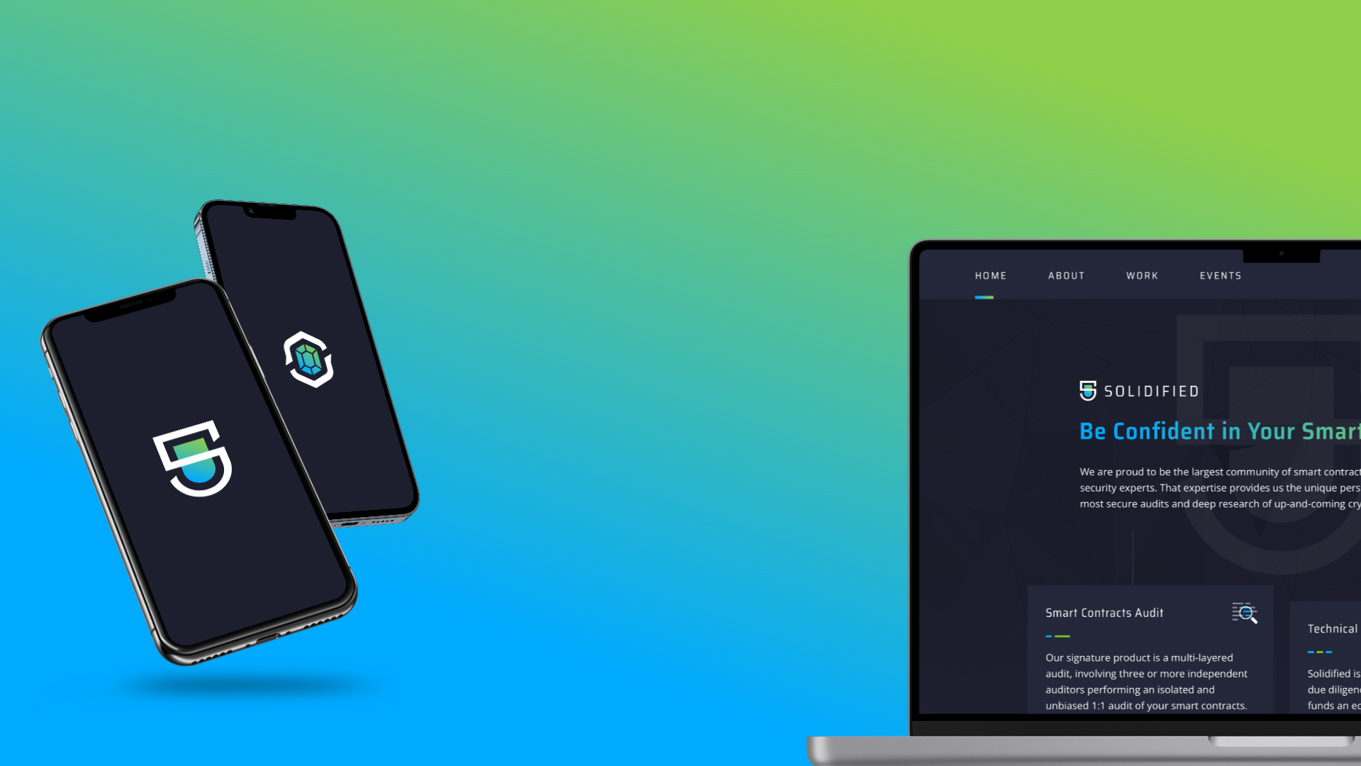
Create a brand image for a new startup entering the emerging market of Decentralized Apps. Represent modern security.
-
Tools
Sketch
Adobe Illustrator
Zeplin
Branding Goals
As a founding member of Solidified my first job was to establish a visual language for the company. My first goal with the logo was to create something simple and recognizable. Elements like the angled hitches would become standards of the visual language for all branding and replicated in the OpenBounty logo. I knew early in the project I wanted to have a pair of colors representing user roles. This had the added bonus of focusing colors away from simple blues that saturate our security competitors. The use of SairaCondensed was used to set a tone for the design. Open Sans was chosen because of how cleanly the fonts work together and because it reads so well in large paragraphs.
Learning and Growth
My focus was on making sure our logo and colors would have an evergreen appeal so any badges or awards we gave to our clients would be proudly shared. I don’t typically use word association and mind-mapping exercises, but for this project it was critical for getting a steady stream of fresh ideas.


